Here’s a simple guide for you about what does paint opacity / paint transparency mean, how does it affect your work, and how to find good opaque and transparent colors.
What Is Paint Opacity?
Opacity is the measure of a coating’s ability to hide the substrate beneath it.
Black coatings typically achieve this in one coat, while yellows or reds might need multiple applications. This quality depends on the coating’s composition, including pigments and fillers, and factors like pigment dispersion and film thickness.
Here’s a list of labels that you can find on your paint tubes/bottles:
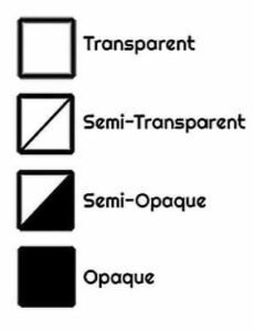
What do the paint transparency symbols mean?
Have you wondered about those little square symbols on paint bottles and tubes, and what exactly do they mean?
Symbols referring to paint opacity or transparency can be found in 3 types:
- Opaque Paints (Solid Square): It will cover underlying layers completely. These are great for base layers, backgrounds, and areas where you want full coverage without seeing the layers beneath. Common opaque colors include Titanium White and Cadmium Red.
- Transparent Paints (Empty Square): Means the paint is transparent. It will show layers beneath it. Ideal for glazing techniques, where you apply thin layers of paint to achieve depth and luminosity. They are also useful for tinting without obscuring the underlying details. Colors like Alizarin Crimson and Phthalo Blue are often transparent.
- Semi-Transparent Paints (Half-Filled Square): They offer a balance between the first two. Signifies semi-transparent paint. It partially covers layers below. They are versatile for both coverage and layering, making them useful for a wide range of painting techniques.
Are the paint transparency symbols the same for both acrylic and oil paints?
Yes, the opacity or transparency symbols – the solid square, empty square, and half-filled square – are used consistently for both oil paints and acrylics. They universally indicate the paint’s covering ability, regardless of the medium, helping artists understand how a particular paint will behave in terms of layering and coverage on the canvas.
While the symbols are generally consistent across different paint brands, it’s always good to check each brand’s specific chart or key, as slight variations may occur.
How does paint opacity / transparency affect my painting?
- Its Impact on Color Mixing: The transparency level can significantly impact how colors mix. Transparent paints can create more depth and luminosity in mixtures, while opaque paints provide more solid color blending.
- Technique Considerations: Your choice of transparent, semi-transparent, or opaque paints should align with your intended painting techniques. For example, glazing and layering techniques often benefit from transparent paints, while techniques like impasto or covering large areas may work better with opaque paints.
- Influence of Mediums: Remember that adding mediums to your paint can alter its transparency. For example, adding a glazing medium to an opaque paint can increase its transparency.
Acrylic/Oil Paint Colors and Their Paint Opacity (Transparency) Ratings
Want to know, which colors are opaque, which semi-opaque and which transparent? Here’s a list of common paint colors along with their typical opacity/transparency levels:
Opaque Colors List:
Titanium White: Highly opaque, excellent for coverage and mixing.
Cadmium Red: A dense, bright red, known for its strong opacity.
Cadmium Yellow: A bright, vivid yellow, also highly opaque.
Ultramarine Blue: Generally opaque, good for deep blue coverage.
Burnt Umber: A rich, dark brown, typically opaque.
Burnt Sienna: Earthy red-brown, usually quite opaque.
Oxide of Chromium: A stable, opaque green.
Cobalt Blue: A bright blue with good opacity.
Mars Black: A strong, opaque black, often used for intense shading.
Cadmium Orange: A bright, strong orange with high opacity.
Naples Yellow: A pale, opaque yellow.
Chrome Green: A vivid, opaque green.
Venetian Red: A deep, earthy red, very opaque.
Cerulean Blue: A sky blue, typically opaque.
Payne’s Grey: A dark blue-grey, known for its opacity.
Olive Green: A muted, earthy green, usually opaque.
Yellow Ochre: A warm, earthy yellow, opaque.
Ivory Black: A softer black, with good opacity.
Raw Umber: A dark, opaque brown.
Semi-Opaque to Semi-Transparent Colors List:
Alizarin Crimson: Often semi-transparent, offering rich, deep reds.
Phthalo Blue: Can vary but generally more on the transparent side.
Raw Sienna: A yellowish-brown, usually more semi-opaque.
Dioxazine Purple: A deep violet, often semi-transparent.
Sap Green: Varies, but typically more on the semi-opaque side.
Cadmium Green: A bright green, often semi-opaque.
Hooker’s Green: A deep, rich green, usually semi-transparent.
Permanent Rose: Vibrant pink-red, typically semi-transparent.
Indian Red: A dark, earthy red, semi-opaque.
Yellow Lake: A bright, semi-transparent yellow.
Cobalt Violet: A soft violet, often semi-transparent.
Lemon Yellow: A bright, sunny yellow, usually semi-opaque.
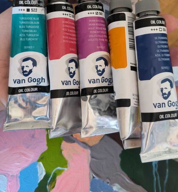
Turquoise Blue: A vibrant blue, semi-transparent.
Manganese Blue Hue: Bright blue, usually semi-transparent.
Quinacridone Gold: A rich gold, often semi-transparent.
Transparent Colors List:
Quinacridone Magenta: Known for its transparency and vibrant hue.
Viridian: A bright green, typically transparent.
Prussian Blue: Deep blue with a transparent quality.
Indian Yellow: A bright, transparent yellow.
Rose Madder Genuine: A classic, transparent red.
Phthalo Green: A deep, vibrant green, transparent.
Transparent Red Iron Oxide: A deep, transparent red.
Ultramarine Violet: A deep, transparent violet.
Permanent Alizarin Crimson: A deep, transparent red.
Permanent Orange: A bright, transparent orange.
Quinacridone Red: A vibrant, transparent red.
Winsor Blue: A deep, clear blue, transparent.
Permanent Yellow Deep: A rich yellow, transparent.
Phthalo Turquoise: A vibrant, transparent blue-green.
Transparent Earth Orange: A rich, transparent orange-brown.
FAQ about paint transparency / opacity
How do I know exactly how transparent the paint is?
It’s beneficial to test paint on a palette or scrap surface to see its actual transparency or opacity, as the symbol provides a general guide but the true effect can be influenced by factors like paint thickness and the color underneath.
For my first set of paints, which opacity / transparency is the best?
As a beginner, having a combination of these (opaque, transparent and semi-transparent paints) will allow you to experiment with different painting styles and learn how layering and coverage work. Over time, you’ll develop preferences for certain opacities based on your personal style and the subjects you paint.
Will several layers of transparent paint make it opaque?
Yes, applying several layers of transparent paint can build up to a more opaque finish. This technique, known as glazing, involves applying multiple thin layers of transparent paint, allowing each layer to dry before applying the next. As the layers accumulate, they can collectively obscure the underlying colors and details, increasing the overall opacity. However, the result might still not be as opaque as using inherently opaque paint. The final effect also depends on the pigment’s inherent characteristics and the thickness of each applied layer.
What happens when you add transparent or semi-transparent paint layer over different underlying colors?
The interaction of transparent or semi-transparent paints with underlying colors and surfaces is a nuanced aspect of painting that can greatly influence the final artwork. For example, when a transparent red, like Alizarin Crimson, is applied over a dark underpainting, it can create a rich, deep color, enhancing the shadows and depth. In contrast, the same transparent red over a light, perhaps yellowish base, might produce a vibrant, warm orange hue due to the yellow showing through.
Best Color Combinations: Using Transparent and Semi-Transparent Paints
Here are 21 examples of color combinations using transparent or semi-transparent paints and the results they yield when layered over different underlying colors:
- Transparent Red (Alizarin Crimson) over Dark Brown: Creates a deep, rich burgundy.
- Transparent Red over Bright Yellow: Results in a vibrant, warm orange.
- Semi-Transparent Blue (Ultramarine) over Grey: Yields a cool, muted blue tone.
- Transparent Yellow (Arylide Yellow) over White: Produces a bright, pure yellow.
- Transparent Yellow over Dark Green: Turns into a greenish-olive tone.
- Semi-Transparent Purple (Dioxazine Purple) over Black: Creates a subtle, deep purple sheen.
- Semi-Transparent Purple over Light Pink: Results in a soft, muted lavender.
- Transparent Green (Phthalo Green) over Blue: Forms a rich, deep turquoise.
- Transparent Green over Burnt Sienna: Transforms into a warm, earthy green.
- Transparent Orange (Transparent Pyrrole Orange) over White: Yields a bright, pure orange.
- Transparent Orange over Light Blue: Creates a soft, muted greenish-gray.
- Semi-Transparent Magenta (Quinacridone Magenta) over Yellow: Produces a vibrant red-orange.
- Semi-Transparent Magenta over Dark Blue: Results in a rich, cool purple.
- Transparent Burnt Umber over Ultramarine Blue: Turns into a deep, cool brown.
- Semi-Transparent Raw Sienna over Black: Gives a muted, warm brownish tone.
- Transparent Phthalo Blue over Light Green: Creates a vibrant, mid-tone green.
- Transparent Viridian Green over Cadmium Red: Produces a muted, earthy brown, as the complementary colors mix to neutralize each other.
- Semi-Transparent Cobalt Blue over Bright Orange: Creates a greyish-blue tone, ideal for shadowed areas in a warm, sunny landscape.
- Transparent Quinacridone Gold over Dark Purple: Results in a rich, warm brown, adding depth and complexity to the shadows.
- Semi-Transparent Venetian Red over Olive Green: Yields a deep, rustic brown, perfect for natural scenes and landscapes.
- Transparent Prussian Blue over Bright Yellow: Forms a vivid green, great for vibrant foliage or grassy areas.
These interactions are influenced not just by the colors involved but also by the texture and reflectiveness of the surface beneath, thus offering countless options for further experimentation and discovery 🙂